For my coursework, I used a PC instead of a mac computer as in my AS coursework, I encountered a few problems with the mac computers as they were not compatible with some of the files. The PCs that we have used in our A level coursework are much more powerful, quicker and are compatible with more files. I found them a lot more easier to use.
In the research stage, I primarily used Google to gather my findings about what music I wanted to use for my music video. I also used Google images to research some existing products, such as existing album covers and posters for my print work. This helped inspire me to come up with my own ideas.
Another platform that I used for research purposes was Youtube.com. This proved useful as the music artist is actually a Youtuber. Therefore, I used her Youtube account as a base platform to find out about my target audience. From there, I used the website YouGov.com to gather further research on my target audience.
I captured all of my research on the blogging website, 'Blogger'. Blogger was useful in many ways as I was able to go back to my initial research on my target audience and artist and then make improvements to my products and designs. Blogger was also useful as I was able to download it in the Apple App Store on my phone, meaning that I was able to make notes anywhere if necessary. One of the main tools I used in Blogger was the embedding tool. I needed to evidence my work and research throughout the coursework, so I used the embedding tool to insert photos, screenshots and even videos into my blog.

In the initial research and planning stage, I had to create a pitch in order to gain audience feedback. I decided to create this using a Prezi. I chose to use Prezi as it is one of the most engaging platforms used to present, in my opinion. I was able to embed this into my blog so that I would be able to access it at any time throughout my production if I needed to.


Another way of documenting my progress was through using Google Drive. A particular service that Google Drive provides is Google Docs. This is accessible from any computer or phone with an internet connection, so it saved me time as I did not have to email my work and notes back and forth to myself. I also quickly made notes on my iPhone as I was thinking of ideas.


I primarily planned my production using an online storyboard, which I created using a website called 'Storyboard That'. This was useful as I was able to refer back to it when I needed to in the coursework. It also allowed me to have a more clearer picture of what I was going to have to film. I also used Microsoft Powerpoint to create a mindmap of basic ideas, which then helped me to develop them into more complex ideas.

Construction
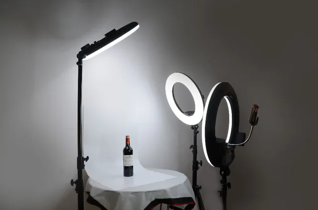
For my print artefacts, I had to take some photographs. To take these photographs, I used a 700d with an array of lenses, including a 50mm and a 18-55mm lens. Having an array of lenses to take photographs and to film with was useful as I could change the ISO, aperture and shutter speed levels to act accordingly to what I was filming/taking photos of. By adjusting the aperture, I achieved blue in my backgrounds. ensuring that the subject would stay in sharp focus at all times. Whilst capturing my photos and footage, I used a tripod to steady the camera, which meant that there wasn't any unnecessary blur or noise in my images. I also used a ring light whilst taking my photographs. This proved to be effective as we were shooting in the Autumn/Winter time, so the natural lighting was quite dull. The ring light enabled crisp, bright lighting.

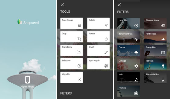
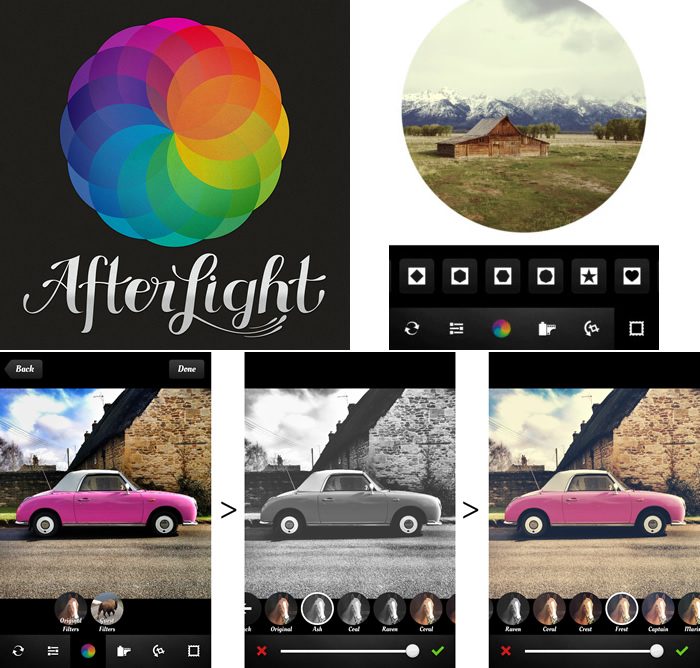
To create and design my initial print artefacts for my digipak, I used an array of mobile apps. These included Afterlight, Superimpose and Snapseed. I used these apps to quickly design some prototypes of my print work as they were quick and easy platforms to use. With Afterlight, I was able to quickly add an effect to my photographs to create an overall aesthetic to them. This ensured consistency to my photographs. With Superimpose and Snapseed, I could create a basic boarder for my cover.
After producing a prototype designs in Afterlight, I edited my final pictures in Adobe Photoshop, where I was able to adjust opacity, contrast, saturation and brightness levels accordingly. I then used a website called Canva.com to produce my final album cover and magazine advert. I began by inserting the photographs I had previously edited in Photoshop to Canva. Canva allowed me to edit the overall layout of the print work. It provides a range of professional fonts to use. In this stage, I studied the album covers that I had found in the research stage to try and grasp the overall codes and conventions of album covers. I would finalise my print work by adding similar codes and conventions to them.

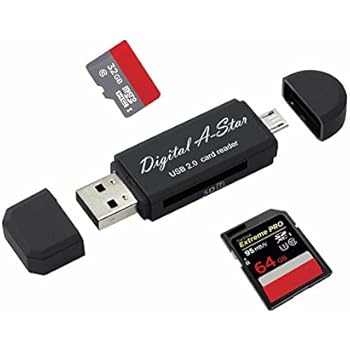
A piece of technology that I primarily used was an SD card and an SD card reader. The SD card that I used was a 64GB one, so I knew that it had enough storage to hold all of my footage. I used an SD card reader as the PCs that we have been working on do not have an SD card slot like the macs or laptops. However, this was not an issue as I had an SD card reader to plug into the computer and import the files onto my user.
To edit my footage, I used Adobe Premiere Pro. This was an excellent software to use as it was quite easy to use and navigate around. I was able to quickly import clips, cut them down and place them in the timeline where appropriate. Another important aspect of my media construction stage was downloading appropriate transitional effects and music. I had to download the music by using a converter and converting the file into an mp3 file. After this, I was able to import it into my Premiere Pro project. I had to complete a similar process for downloading the light leak effects.

Another Adobe Program that I used was After Effects. I had to use this to create the title file and to draw onto some of my clips. This was quite an easy program to use, however it was very time consuming as you had to draw onto each frame individually. Therefore, it could take me hours at a time to edit one clip of footage. To learn how to create the animated title and the 'doodle' effect, I watched a few tutorials on Youtube. These were very useful as I would have been quite confused about which tools to use to create the right effect. The tool that I mainly used was the 'paint' tool, which allowed me to freely draw onto a clip.

Evaluation
Question 1
To complete my coursework, I had to evaluate my production. To do so, I used various pieces of technology. I wanted to create an animated presentation for this question to keep the viewer engaged. I began by using Adobe's free online software, 'Adobe Spark'. However, I quickly realised that this was not an appropriate platform as I was unable to edit the font size, limiting me to what I could write. It also does not give you the ability to change backgrounds and colours of the slides. I did however, like the layout of the slides. It gave you the ability to use a split screen if you so wished, enabling you to present a video or photo on one side of the screen, whilst you spoke about it in the other. I tried to research other websites and platforms that I could present this question on, but in the end I decided to settle with Powerpoint as you had to pay a certain fee to gain full access to all of the features on most websites. I really developed my basic knowledge using Powerpoint whilst completing this question. I learnt how to use transitions on slides without them looking too tacky. I also learnt how to insert videos into a Powerpoint, which is something I'd never done before. I needed to embed my Powerpoint into blogger, but found quite a few difficulties with this. First of all, the Powerpoint was too large of a file at 360MB. I needed to reduce it to around 200MB in order to upload it. I reduced the file by compressing any videos and photos within the Powerpoint to a smaller resolution, which in turn would reduce the size of the whole file. I ended up reducing it to around 190MB. After this, I used Microsoft's online platform called OneDrive to upload my Powerpoint and create an embed code. I was then able to embed my Powerpoint into Blogger.
Question 2
I opted to create a video with a voice over for this question. I thought that this was the best decision for this question as I was able to talk about my products whilst visually showing the viewer my work. I was able to show how I edited the prototypes of my print products by using the screen recording function that is provided on Apple iPhones. Therefore, I could walk through the construction process in detail whilst the viewer could visually see the steps I took in creating the product. I used my Canon 700d DSLR to record the audio as I knew that it was high quality. To edit the video, I used Adobe Premiere Pro as I had knowledge of how to use the software from previously editing my music video. I also created GIFS to insert into my video as I thought that these would illustrate my points even further. I created the GIFS using the website Giphy. I also used Publisher to crop my digipak and magazine advert to give the viewer a closer look at the details that I included within my work.
Question 3
For one of the questions, I had to gather audience feedback. I wanted to create a survey/questionnaire as I thought it was a quick and easy way to retrieve data, I wanted to make the questionnaire easy to access for audiences, therefore I thought that creating the questionnaire on Monkey Survey would be the best option. Monkey Survey allowed me to create a link which I could send to my peers and friends in order to receive feedback. It also had the option of embedding the survey into a blog post. I used a Prezi to present my overall feedback. Prezi was an easy and accessible platform to use as I was able to insert photos, texts and videos. It is a good platform to use if you want to make presentations quite personalised. Another advantage that Prezi had was the ability to embed the slideshow into blogs. So, I could present the Prezi on Blogger.

Question 4
For this question, I decided to write an essay explaining what sort of media technologies I used throughout my coursework. I also decided to embed pictures and screenshots into the essay so that the reader could clearly see what I was explaining. I think that writing an essay for this question was useful as I could go into lots of detail whilst explaining points.

Construction
For my print artefacts, I had to take some photographs. To take these photographs, I used a 700d with an array of lenses, including a 50mm and a 18-55mm lens. Having an array of lenses to take photographs and to film with was useful as I could change the ISO, aperture and shutter speed levels to act accordingly to what I was filming/taking photos of. By adjusting the aperture, I achieved blue in my backgrounds. ensuring that the subject would stay in sharp focus at all times. Whilst capturing my photos and footage, I used a tripod to steady the camera, which meant that there wasn't any unnecessary blur or noise in my images. I also used a ring light whilst taking my photographs. This proved to be effective as we were shooting in the Autumn/Winter time, so the natural lighting was quite dull. The ring light enabled crisp, bright lighting.
To create and design my initial print artefacts for my digipak, I used an array of mobile apps. These included Afterlight, Superimpose and Snapseed. I used these apps to quickly design some prototypes of my print work as they were quick and easy platforms to use. With Afterlight, I was able to quickly add an effect to my photographs to create an overall aesthetic to them. This ensured consistency to my photographs. With Superimpose and Snapseed, I could create a basic boarder for my cover.

After producing a prototype designs in Afterlight, I edited my final pictures in Adobe Photoshop, where I was able to adjust opacity, contrast, saturation and brightness levels accordingly. I then used a website called Canva.com to produce my final album cover and magazine advert. I began by inserting the photographs I had previously edited in Photoshop to Canva. Canva allowed me to edit the overall layout of the print work. It provides a range of professional fonts to use. In this stage, I studied the album covers that I had found in the research stage to try and grasp the overall codes and conventions of album covers. I would finalise my print work by adding similar codes and conventions to them.

A piece of technology that I primarily used was an SD card and an SD card reader. The SD card that I used was a 64GB one, so I knew that it had enough storage to hold all of my footage. I used an SD card reader as the PCs that we have been working on do not have an SD card slot like the macs or laptops. However, this was not an issue as I had an SD card reader to plug into the computer and import the files onto my user.
To edit my footage, I used Adobe Premiere Pro. This was an excellent software to use as it was quite easy to use and navigate around. I was able to quickly import clips, cut them down and place them in the timeline where appropriate. Another important aspect of my media construction stage was downloading appropriate transitional effects and music. I had to download the music by using a converter and converting the file into an mp3 file. After this, I was able to import it into my Premiere Pro project. I had to complete a similar process for downloading the light leak effects.

Another Adobe Program that I used was After Effects. I had to use this to create the title file and to draw onto some of my clips. This was quite an easy program to use, however it was very time consuming as you had to draw onto each frame individually. Therefore, it could take me hours at a time to edit one clip of footage. To learn how to create the animated title and the 'doodle' effect, I watched a few tutorials on Youtube. These were very useful as I would have been quite confused about which tools to use to create the right effect. The tool that I mainly used was the 'paint' tool, which allowed me to freely draw onto a clip.

Evaluation
Question 1
To complete my coursework, I had to evaluate my production. To do so, I used various pieces of technology. I wanted to create an animated presentation for this question to keep the viewer engaged. I began by using Adobe's free online software, 'Adobe Spark'. However, I quickly realised that this was not an appropriate platform as I was unable to edit the font size, limiting me to what I could write. It also does not give you the ability to change backgrounds and colours of the slides. I did however, like the layout of the slides. It gave you the ability to use a split screen if you so wished, enabling you to present a video or photo on one side of the screen, whilst you spoke about it in the other. I tried to research other websites and platforms that I could present this question on, but in the end I decided to settle with Powerpoint as you had to pay a certain fee to gain full access to all of the features on most websites. I really developed my basic knowledge using Powerpoint whilst completing this question. I learnt how to use transitions on slides without them looking too tacky. I also learnt how to insert videos into a Powerpoint, which is something I'd never done before. I needed to embed my Powerpoint into blogger, but found quite a few difficulties with this. First of all, the Powerpoint was too large of a file at 360MB. I needed to reduce it to around 200MB in order to upload it. I reduced the file by compressing any videos and photos within the Powerpoint to a smaller resolution, which in turn would reduce the size of the whole file. I ended up reducing it to around 190MB. After this, I used Microsoft's online platform called OneDrive to upload my Powerpoint and create an embed code. I was then able to embed my Powerpoint into Blogger.
Question 2
I opted to create a video with a voice over for this question. I thought that this was the best decision for this question as I was able to talk about my products whilst visually showing the viewer my work. I was able to show how I edited the prototypes of my print products by using the screen recording function that is provided on Apple iPhones. Therefore, I could walk through the construction process in detail whilst the viewer could visually see the steps I took in creating the product. I used my Canon 700d DSLR to record the audio as I knew that it was high quality. To edit the video, I used Adobe Premiere Pro as I had knowledge of how to use the software from previously editing my music video. I also created GIFS to insert into my video as I thought that these would illustrate my points even further. I created the GIFS using the website Giphy. I also used Publisher to crop my digipak and magazine advert to give the viewer a closer look at the details that I included within my work.
Question 3
For one of the questions, I had to gather audience feedback. I wanted to create a survey/questionnaire as I thought it was a quick and easy way to retrieve data, I wanted to make the questionnaire easy to access for audiences, therefore I thought that creating the questionnaire on Monkey Survey would be the best option. Monkey Survey allowed me to create a link which I could send to my peers and friends in order to receive feedback. It also had the option of embedding the survey into a blog post. I used a Prezi to present my overall feedback. Prezi was an easy and accessible platform to use as I was able to insert photos, texts and videos. It is a good platform to use if you want to make presentations quite personalised. Another advantage that Prezi had was the ability to embed the slideshow into blogs. So, I could present the Prezi on Blogger.

Question 4
For this question, I decided to write an essay explaining what sort of media technologies I used throughout my coursework. I also decided to embed pictures and screenshots into the essay so that the reader could clearly see what I was explaining. I think that writing an essay for this question was useful as I could go into lots of detail whilst explaining points.


